The Death of Dashboards: How 50 Words Beat the Famous 1,000-Word Picture

Somewhere in your organization, an analyst just shipped a beautiful new dashboard. It'll get a burst of attention this week, then join the graveyard of tabs nobody opens. I've watched this exact pattern play out at company after company: real BI budget, dozens of polished dashboards, and executives who still ping someone on Slack asking "wait, what's our number this week?"
That's not a tooling problem. It's a format problem. A dashboard is a fixed answer to a question someone anticipated months ago. The question that actually matters this week is almost never the one already built into a chart.
By the end of this year, Gartner projects more than half of enterprise analytics interactions will happen through natural language — typed or spoken questions — rather than an analyst dragging boxes onto a canvas.[1] This isn't a distant prediction. PayPal now runs governed conversational analytics against its Looker warehouse through Claude, grounding every AI answer in the same semantic layer its dashboards already use — no separate "AI version of the truth" to reconcile.[2]
The shift is from screens to conversations. Here's where I see organizations get stuck, one pattern at a time, and what actually moves you past each one.
The dashboard nobody opens
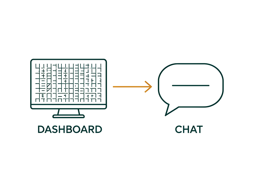
What it is: you commission a dashboard, ship it, celebrate the launch. Six months later it's a bookmark nobody remembers exists. This isn't a discipline problem on your team's part — most BI dashboards see a steep drop-off in use within a year of launch, with industry estimates putting abandonment as high as 60-80%.[3]
The limit: a dashboard answers the question it was built to answer, forever, whether or not that's still the question anyone's actually asking.
How to start: before commissioning the next dashboard, ask whether a plain-English query against your existing warehouse would answer it just as well, today, without a build cycle. If the answer is yes, you don't need a dashboard. You need someone who can ask the warehouse a good question.
“You don't need a dashboard. You need someone who can ask the warehouse a good question.”
Fifty-plus tools, fifty-plus versions of the truth
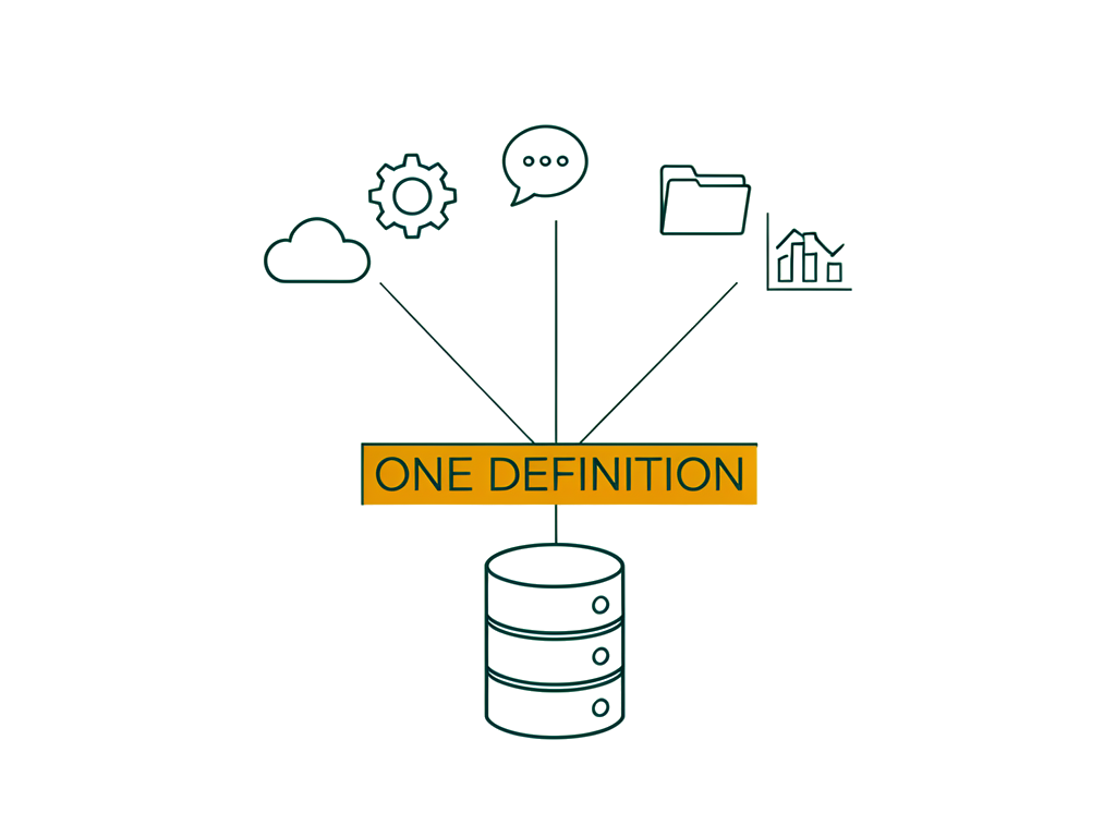
What it is: fast-growing companies routinely run 50+ SaaS tools, and nearly every one ships its own "single source of truth" dashboard. Nobody agrees on the real number because nobody's actually looking at the same table.
The limit: consolidating into one BI tool doesn't fix this on its own — it just moves the disagreement into one interface instead of five.
How to start: the fix isn't a better dashboard. It's a canonical semantic layer that every query — chat-based or otherwise — has to route through. Get that right first, and it doesn't matter whether the front end is a dashboard, a Slack bot, or a chat window.
Ready to fix your semantic layer before your next BI decision?
Let's talk through what a canonical definition layer would take for your stack.
Dashboards only answer the questions someone already thought to ask
What it is: a dashboard is frozen at the moment it was designed. A new competitive threat or an emerging pattern in the data doesn't show up until someone requests a new build — and in most organizations, that request sits in a backlog for weeks.
The limit: your best insight this quarter is very likely the one nobody built a chart for.
How to start: this is where conversational analytics earns its keep for real, not as a nice-to-have. "What do my best-performing deals have in common?" doesn't need a ticket in someone's backlog — it needs a warehouse that can be asked the question directly, and answer honestly when it doesn't know.
Dashboards show what happened, never why
What it is: a chart flags an anomaly — churn ticked up, conversion dropped — and that's where the dashboard's job ends. The actual work, the digging through filters trying to explain it, starts after the dashboard has already told you everything it's going to tell you.
The limit: root-cause investigation is exactly the kind of multi-step, judgment-light digging that eats analyst hours without actually needing analyst judgment.
How to start: an AI agent that can chain several queries together and propose a narrative — "conversion dropped after demo attendance fell following the pricing change" — turns a day of digging into a few minutes of verification. Verification, not blind trust: someone still has to check the story holds up.
One dashboard, every audience, all the same noise
What it is: the weekly dashboard email goes out to the VP and the individual contributor alike — same fifteen charts, same data dump — and everyone's left to figure out what's actually relevant to them.
The limit: more information isn't more insight. Cognitive load isn't a feature, and a dashboard built for everyone is often genuinely useful to no one.
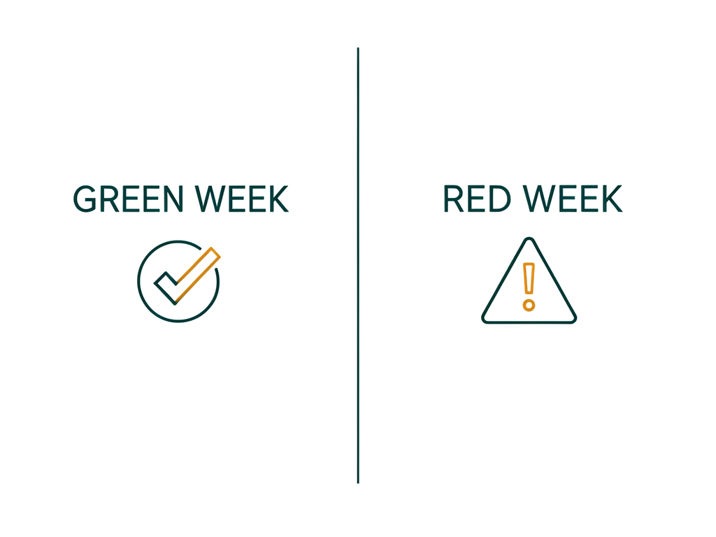
How to start: replace the blanket snapshot with a short, role-specific narrative. A "green week" for an executive might be one sentence: revenue's up 3%, everything's in normal range, nothing needs your attention. A "red week" names exactly what moved and why. That's fifty words doing more work than the thousand-word picture it replaced — which is the whole thesis of this piece.
“That's fifty words doing more work than the thousand-word picture it replaced”
Where are you?
Most organizations I work with aren't choosing between dashboards and chat-first analytics as a single, all-or-nothing decision. They're sitting on a pile of dashboards nobody trusts, a warehouse that could answer good questions if anyone asked it directly, and no governed way for non-technical staff to do that safely yet. Forrester research puts real numbers on that last gap: only around 20% of non-IT professionals can currently fulfill their own BI requirements through self-service tools.[4]
You don't need to rip out your BI stack to start closing that gap. You need one governed, chat-first entry point into your existing warehouse, tested on the questions your team actually asks — not the ones a dashboard roadmap anticipated a year ago.
Pattern | The limit | Start here |
|---|---|---|
The dashboard nobody opens | Answers a frozen question, forever | Ask if a live query beats the next dashboard build |
Fifty-plus tools, fifty-plus truths | More interfaces, same disagreement | Fix the semantic layer before the front end |
Only answers questions someone anticipated | Best insights never get a chart built for them | Let people ask the warehouse directly |
Shows what, never why | Root-cause digging eats hours for no good reason | Chain queries into a verified narrative |
One dashboard, every audience | Cognitive load, not insight | Replace the blast email with a role-specific one |
Footer
If your team is drowning in dashboards nobody trusts and a warehouse nobody's allowed to just ask, that's exactly the kind of gap I help executives close — governed, safely, without a six-month BI overhaul. Reach out and let's talk through what a chat-first entry point would look like for your specific stack.
References
Conversational Analytics Software: 7 Top Tools for 2026 — Gartner's projection that natural language, search, and voice will drive the majority of enterprise analytics queries by the end of 2026.
PayPal case study — Google Cloud — PayPal's governed conversational analytics deployment on Looker via Claude and the Looker MCP Server.
Business Intelligence Dashboards That Drive Decisions — industry estimates on BI dashboard abandonment rates.
Business Intelligence (BI) Statistics For 2025–2026 — Forrester research on self-service BI fulfillment rates among non-IT professionals.

Chat with the author
If you'd like to make a connection and perhaps collaborate on something:I'd love to talk with you!No matter if you want to build your professional network,or think there might be a great opportunity to to work together or partner.